Nearly every football club has showed off their new kits for the forthcoming season sparking a flurry of articles trying to rank them from best to worst.
There have been some triumphs - Arsenal’s much-heralded return to adidas and West Ham’s 1980 inspired kits from Umbro for example - but also some tragedies like Manchester’s United’s beige away. But look further down the football ladder and there are some gems which won’t be filling the rails in your local Sports Direct. We thought it was time the spotlight was turned on some beauties you may have missed.
Newport County
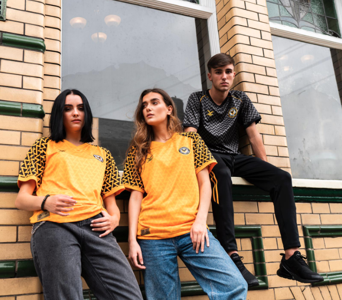
Sportswear aficionado and author Neal Heard was again given the task of designing his beloved Newport County’s kits for the new campaign. He has kitted them out in two absolute belters - home and away both “sponsored but unsponsored” by Paddy Power.
Heard told the club’s website: “Lots of the big clubs are going back to the old, retro classical designs of kits from the past like Nigeria and Arsenal’s bruised banana design.
“Hull have also gone back, Derby County as well. “I really liked the new-look design, but at the same time I didn’t want to offend any of our fan base and go away from any traditional County colours. I think this marries the two together and is the best of both worlds.”
Shoot locations included @NewportTransBri, @NewportRising, @WaterlooHotel and @ringmaster_uk 🙌
📸
#SaveOurShirt
Hartlepool United
Irish sportswear giants O’Neills have established a foothold in England in recent years as one of the most in-demand suppliers of rugby league kits for clubs including St Helens and Warrington Wolves.
They’ve made inroads in football too with Wycombe Wanderers and this season they’re supplying Hartlepool United. The home kit is a dashing blue number but we want to talk about the goalkeeper kit - a head-turning yellow jersey with sleeves like the curtains you might have found in a teenage girl’s bedroom in the 1980s.
#Pools
Coventry City
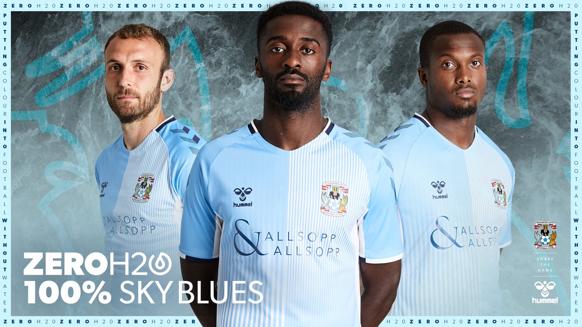
Danish brand Hummel have taken over the Coventry kit deal after a lengthy absence and they have marked the reunion with two kits which give a knowing nod back to the 1980s. This news was greeted with delight by fans of the Sky Blues after a few years wearing Nike templates.
While not a complete copy of one of the club’s most memorable designs, it is a joyous blend of old and new which has delighted fans in a difficult summer for the club which has seen them relocate to Birmingham.
Luton Town
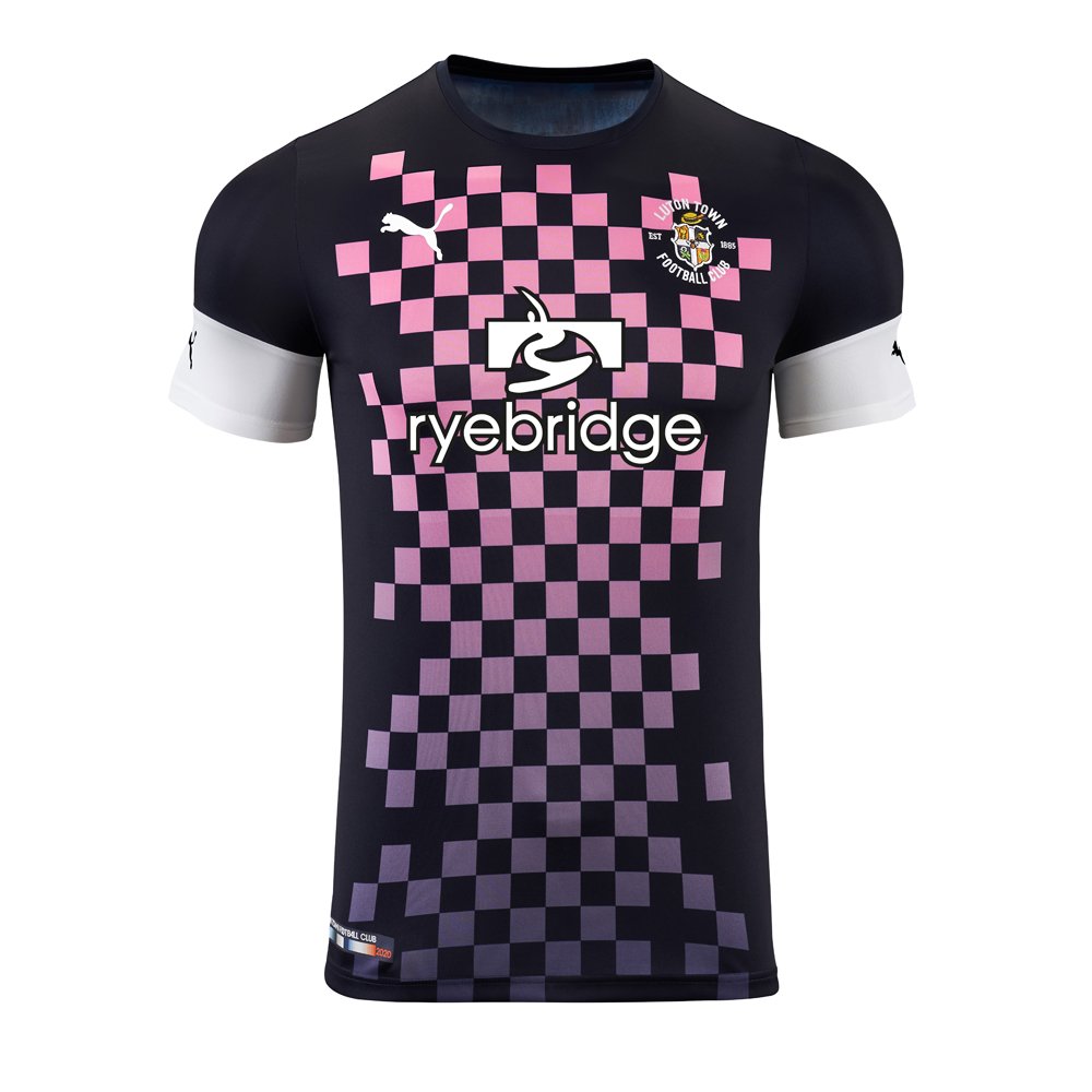
It’d be easy for me to say the Puma designers are as mad as Hatters for coming up with this bold third kit. A dark blue with pink chequerboard effect, this shirt is destined to be filed under cult classics. One wonders what their most famous fan - the late, great Eric Morecambe - would have made of such an outlandish shirt.
Middlesbrough
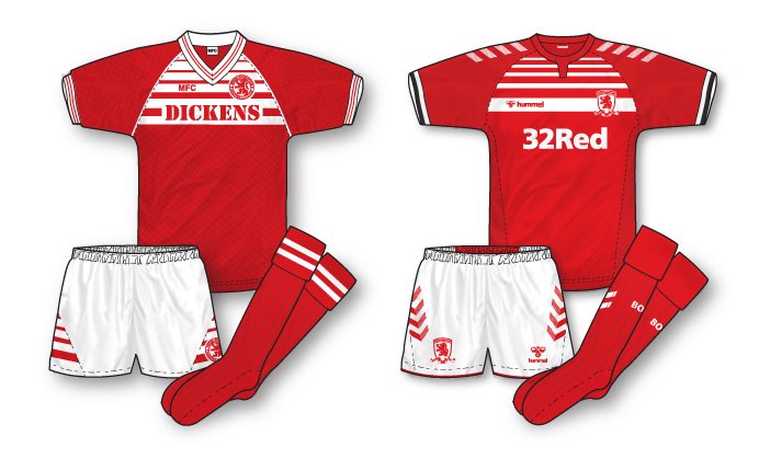
As we've established, Hummel love to delve into their archives and they have resurrected a classic Boro kit from the 1980s, using white lines across the chess which increase in width. The 32 Red sponsor doesn’t detract from a very classy design and the away choice - white with a red and blue band across the chest is not too shabby either.
#middlesbrough #hummel
Cambridge United
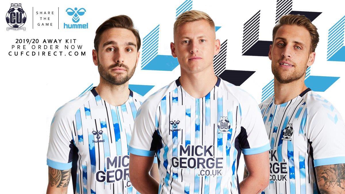
Hummel flicked through the history books for the inspiration for Cambridge’s away kit and came up with a new twist on a design from 1993/94, featuring blue stripes which from a distance look like the latter stages of a game of Tetris.
Cheltenham Town
A striking azure kit from Errea, Cheltenham’s third kit will look great in the summer. The club says the colour is inspired by the town’s coat of arms and it represents the town’s spa waters.
Grimsby Town
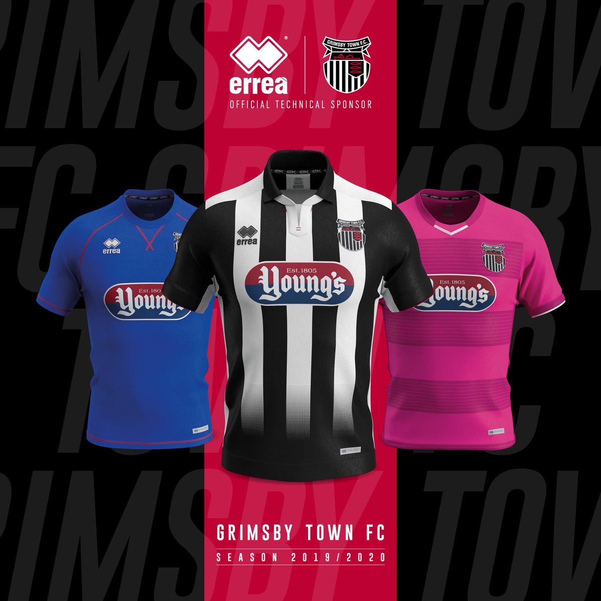
In a year when Juventus famously (foolishly) chose halves over traditional stripes, Grimsby have shown that when done well, nothing looks classier than black and white stripes. Nicely finished off with an old-school collar and a black fade, this Errea effort is on point.
We are open 9am - 2pm today for you to get your 2019/20 replica kits, new trainingwear and season tickets!
All items are also available online using the link below 👇
#GTFC
Plymouth Argyle
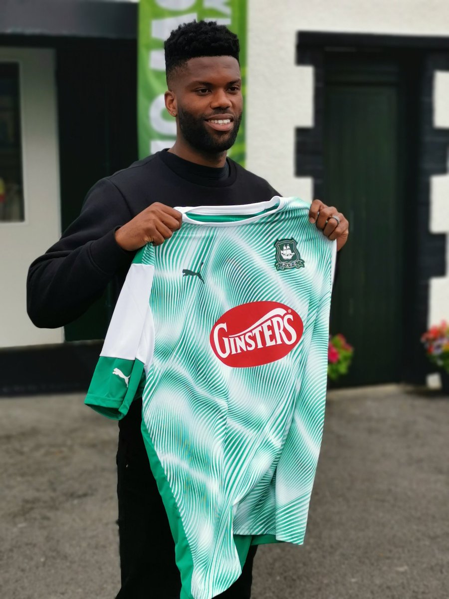
The Pilgrims rarely stray too far from their famous green colours and both their away and third kits are worthy of closer investigation. The away kit, a spiral affair by Puma which looks like a lime ice cream sundae, gets our vote here.
Stevenage
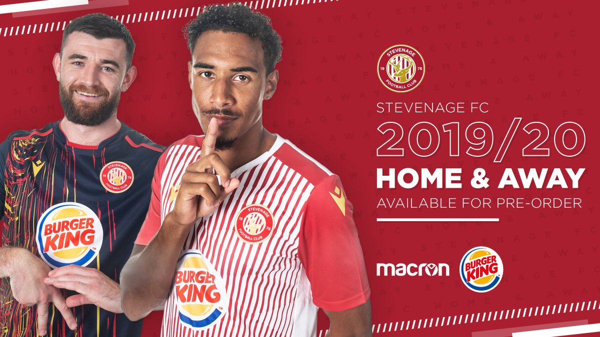
You can’t avoid the Burger King logo on Stevenage’s new Macron kits and the home effort - narrow red and white stripes - is quite an eye burner. But the away kit manages to take the colours from the takeaway’s logo and it actually works pretty well.
PRE-ORDER 💳:
Morecambe
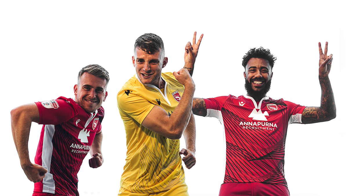
The Lancashire club have let Macron off the leash for their home kit which while predominately red has a dazzling criss-cross Tron sublimation though the neck could have done with some work.
